Case Studies

Leadership portfolio showcasing impact and methodology

â–Ľ
Leadership Ă— Design

Design Systems: How One Designer Built What Engineering Couldn't

The Problem

We were modernizing legacy UIs with a small design team and no front-end resources. New interfaces are daunting and visible—sales wants demo-ready visuals, developers want plug-and-play components, clients don't want workflow disruption.

We knew legacy workflows don't get better in a new skin. And accessibility had to be step one, or it wouldn't happen at all.

Without a living design system, every component meant 2-3 clarification questions per user story, retrofitted accessibility, and inconsistent quality across teams.

Everyone loved the idea of coded component libraries so devs didn't have to guess. But there were no developers available to build it. So the idea sat.

The Leadership Decision

During a team meeting, one of the designers asked: "Could I just make it myself?"

I had two choices: protect them from scope creep and keep waiting, or trust the team to reorganize and let someone own something big.

I chose the second:

  • Let the team talk through how to redistribute work
  • Got budget for Claude Code and Vercel (positioned as an AI-forward experiment)
  • Set boundaries: couldn't break stride with business as usual
  • Stepped back once the framework was set

What We Built

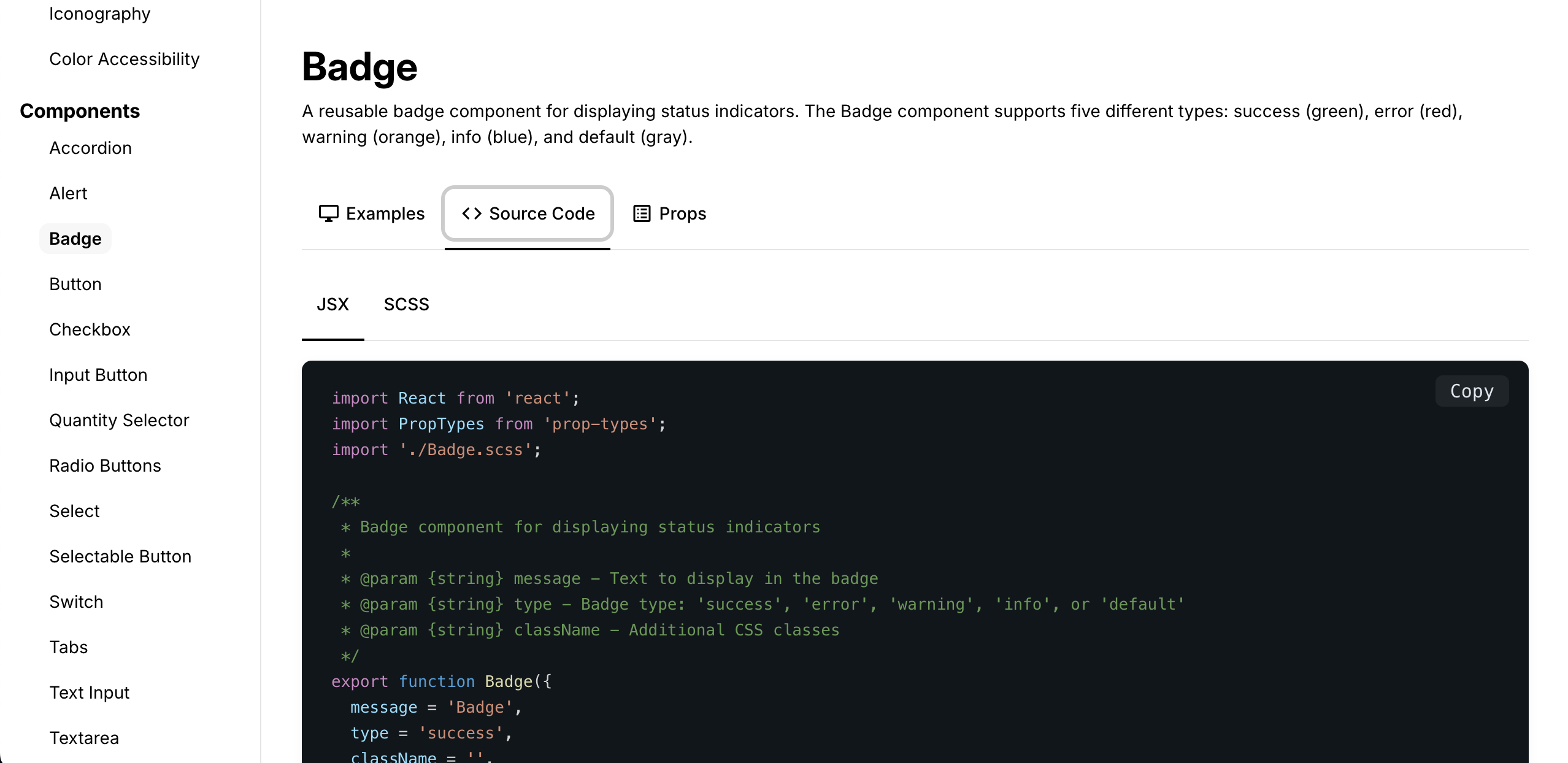
Using Figma libraries and Claude Code, we built a functional living design system with:

  • Every UI component in code
  • Accessibility baked in: ARIA tags, semantic HTML, WCAG compliance
  • Dev niceties: props, variants, color pickers, multi-language support
Design system badge component showing visual design with multiple variants and states
Component design in Figma with all variants and states documented
Live coded badge component with interactive props, variants, and customization options
The same component live in code with full interactivity and developer controls

The Impact

Eliminated friction:

  • Design-dev questions dropped from 2-3 per story to zero
  • 3 out of 4 dev teams now use system components as default
  • PMs saw value in fewer refinement questions

Accessibility by default:

  • Pre-system: inconsistent, retrofitted
  • Post-system: WCAG-compliant out of the box
  • QA proactively started adding accessibility to test criteria—first time ever—because the system made it achievable

Strategic positioning:

  • Executives noticed the clever use of Claude, GitHub, Vercel
  • Team became seen as AI-forward
  • Other dev teams requested their own systems

What This Proves

Design systems aren't outlandish ideas. But building one with limited resources while not breaking stride needed collaboration, trust, and creativity.

This worked because I trusted the team to solve their capacity problem, removed blockers instead of micromanaging, and made accessibility non-negotiable from day one.

If a team member asks to be responsible for something big, I always say yes and support them to succeed.

Leadership Ă— Design

Multiple Ways: Designing for Users Who Don't Agree

The Problem

Enterprise software lives in a world where users fundamentally disagree about how things should work.

Legacy users have decades-old workflows. They know the system inside and out, have workarounds, sometimes even custom development. They're fast, efficient, and deeply resistant to change.

New users need modern, intuitive interfaces. But updating the UI without angering legacy users is a minefield — and there's a technical challenge too: bubble-bloat. Older UIs were tight and unadorned. Adding modern design standards — generous padding, corner radii, larger fonts, shadows — can turn one compact page into four sprawling screens.

The question: How do you update the UI for users with a decade in the game, make it genuinely better, and not ruin their lives?

The Approach: Start With What Users Actually Do

We talked to users, watched them configure and navigate, and used tracking data to see what actually gets used.

What we discovered: users skipped entire sections and tabs, homing in on the exact field they needed. Everything else? Rarely touched.

The opportunity was clear — bring what users need to the forefront. Architect pages according to real behavior, not a scattered group of potentially useful fields.

The Consumer Challenge: Sock, Sock, Shoe, Shoe?

The same "multiple ways" problem appeared in consumer ticketing.

Users buying tickets need to make lots of decisions — checking dates, texting a friend, scoping out parking, finding accessible seats — all during a timed checkout. Recipe for frustration.

Starting with seat selection, we looked at how users choose seats and price types. Most venues offer at least Adult, Senior, and Child pricing. So you select a location, pick a price type, then continue.

But as a client put it: Do you go sock, sock, shoe, shoe — or sock, shoe, sock, shoe?

One sounds wrong to most people. But we're not putting on shoes — we're buying tickets. User testing revealed two completely valid workflows:

  • Some users chose all locations first, then assigned price types
  • Others completed one full seat (location + price type) before moving to the next

Two completely different mental models. Both correct.

The Solution: Do Both

The challenge I gave the designer: "Do both."

Orlando took the direction and designed a way to support both workflows simultaneously — intuitive and mobile-first. Users could select multiple seats then assign price types in bulk (sock, sock, shoe, shoe), or complete one seat fully before moving to the next (sock, shoe, sock, shoe). The system supported both without forcing one or making the other feel wrong.

Mobile seat selection interface showing dual workflow support - users can select multiple seats then assign price types, or complete one seat at a time
The price selection interface supporting both mental models simultaneously

The Broader Lesson

The best solutions don't force users into one "correct" workflow. When users fundamentally disagree about how something should work, the answer isn't to pick a side, create separate modes that fragment the experience, or default to legacy and ignore modern needs. The answer is to design systems flexible enough to support multiple mental models simultaneously.

This requires deep understanding of actual behavior — not assumed workflows — and a willingness to challenge "one right way" thinking. It applies beyond seat selection: in enterprise UI, it means reorganizing around real usage patterns, honoring power users' muscle memory while making things discoverable for beginners, and making change incremental rather than disruptive.

The ultimate goal: build systems that adapt to users, not users who adapt to systems.

Impact

  • Seat selection supported two completely different mental models without sacrificing simplicity
  • Legacy enterprise users maintained efficiency while new users found interfaces more approachable
  • Reduced checkout abandonment by removing forced workflows
  • Proved that "intuitive" doesn't mean "one way only"
Leadership Ă— People

Revolving Bosses, Zero Problems: How to Build Team Stability in Chaos

The Problem

Growth companies are exciting—fast-paced, high-stakes arenas where change is the mantra.

They also come with challenges.

Over 7 years, I've had 9 different bosses, two CEOs, and countless executives move through the org.

This kind of change breeds uncertainty and shifting priorities that can cripple teams with fear and distraction.

I've seen the burnout firsthand. The resentment. The good people who leave because they can't take one more reorganization.

So the question is: how do you maintain a strong team of contributors and achieve 100% positive engagement scores every single quarter through all of that?

It's not magic.

It's people.

What I Did Differently

Most leaders try to shield their teams from organizational chaos. They absorb the uncertainty, filter the messaging, and hope stability at the top eventually trickles down.

I did the opposite.

I gave my team context and accountability—then stepped back.

Here's what that looked like in practice:

Context without sugarcoating:

When leadership changed, I didn't pretend everything was fine. I told the team what was happening, what it meant for our work, and what we could control vs. what we couldn't.

Uncertainty is worse than bad news. People can handle change if they understand it.

Distributed ownership, not delegation:

I didn't assign tasks—I assigned outcomes. Designers owned their domains completely. They decided how to solve problems, defended their decisions in stakeholder conversations, and presented their own work.

When they did something well, it was all theirs. They got to be proud.

Pushed them into the room:

No more "I'll handle the stakeholders." My team ran high-stakes conversations with product, engineering, and executives directly.

They learned to shape product strategy, not just execute it. They became leaders in their own sphere.

Made their contribution visible:

When someone solved a hard problem, I made sure people knew. Not in a performative "shout-out" way—by putting their name on the work and letting them own the outcome in front of the org.

People need to understand they're good at something and that others appreciate them personally. That's gold for morale and productivity.

The Results

Team stability through organizational chaos:

  • 100% positive engagement scores every single quarter for 7 years
  • Low voluntary turnover despite 9 leadership changes
  • Team continuity while other functions churned

Designers who became leaders:

  • Multiple team members became de facto leaders within their teams.
  • Designers routinely led cross-functional initiatives without me in the room
  • High-quality output maintained through constant org restructuring

Sustained performance, not burnout:

So many designers on my team go the extra mile—not because of quarterly revenue goals, not because of peppy huddle speeches.

Because they know they're making a difference.

While the winds shifted around the ship and the waves moved in, everyone knew exactly what they were supposed to do to keep the ship alive.

Because they knew the ship. And they knew their role.

They could do it better than anyone else—and they knew that.

What This Proves About Leadership

I strongly believe most people care about their work, their workplace, and want their contribution to be high quality and meaningful.

The question is whether you create the conditions for that to happen.

Transparency builds trust. Ownership builds confidence. Confidence builds leaders.

It's a wonderful feeling to watch people nod and get to work, knowing they're excited to do the best they can—and love every minute of it.

Even when everything around them is changing.